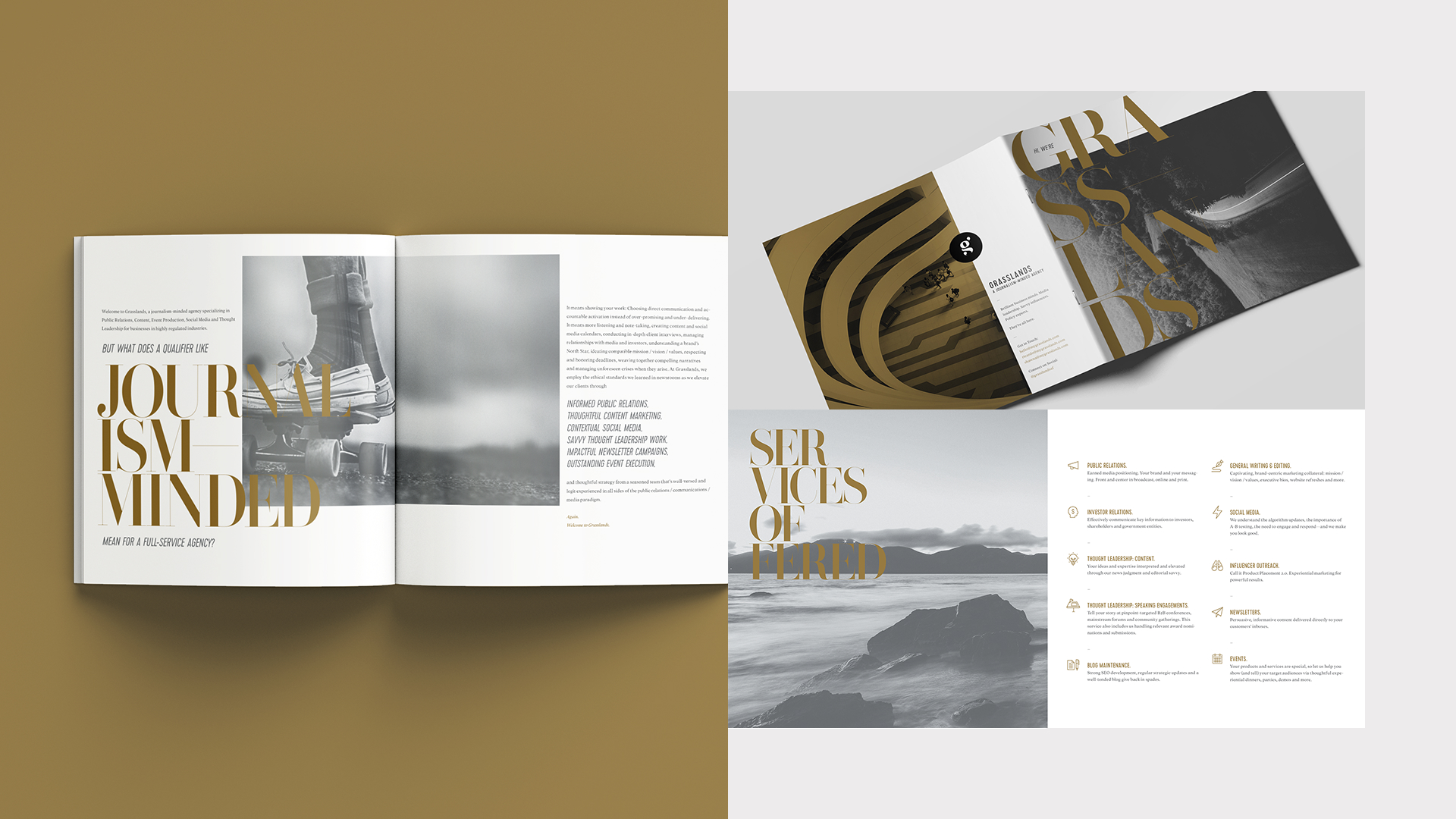
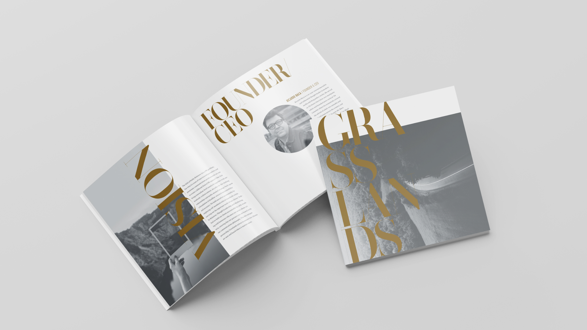
Striking examples from the capabilities brochure. We felt the piece should read like an art gallery program, with a similar level of austerity.
We had a lot of fun with the typography, allowing it to spill over edges and break unexpectedly. The abstract photography, cropped at unusual angles and given ample white space, helps underscore the playfulness.